TL;DR
As the sole writer on the team, I wrote all of the UX content for the new Wix Referral Program app. Over the course of seven months, I conducted research, established a glossary of terms, drafted content, liaised with my own and external teams to solicit for feedback, hosted usability sessions, finalized content, and ran the localization processes.
Keep in mind that the case study is long, but still it’s just a snapshot of all the work that went on. If you’d like to discuss this case in person instead, I’d be happy to walk you through it.
Wix Referral Program is a new app that’s being developed at Wix. It’s been one of the top feature requests at Wix for a few years, especially for our eCommerce and restaurant users.
This was a large project spanning seven months. It was split into three parts:
- The live site. We needed to give our users an effortless way to customize the look of their referral program on their site. The pressure point here was speed. Our placeholder content had to be good enough for our users to launch their program with it, if need be.
- The dashboard. Setting up all of the configurations of the referral program should be effortless, from choosing what reward they’d like to give their customers, to setting up what email automations they’d like to send out. N.B. This part isn’t described in this case study yet, but it will be added soon.
- The mobile apps. This part isn’t described in this case study, but it will be added as a separate case study soon.
The main KPIs of this project were (1) feature adoption, (2) GPV from referred customers, and (3) Wix premium account holders.
My role
I was the sole UX writer on the team, working alongside a project manager, two product designers, three front-end developers and three back-end developers. I was involved from the very start, i.e. user interviews and wireframes, to the localization of all the content for a global launch. I also liaised with the legal, marketing, and support teams.
Research
As the product designers were putting together the first wireframes and the product manager was busy scoping out the project, I conducted extensive research to establish the terminology and compile an initial glossary of terms.
I looked at:
- User voice. What language do our potential users use when talking about referrals? I used the Dovetail app for this. This wasn’t as helpful as I’d hoped, as there was no substantive consistency between the 8 interviewees. For example, the person making the referral was called referring person, referrer, submitter, and referring customer.
- Wix itself. Wix Referral Program is integrated with four other native Wix apps. I looked at those products and talked with their respective UX writers to align on terminology. For example, when it comes to the person making the referral, should they be called a customer or a member?
- Competitors. I went through all of the main flows on the apps of our competitors, looking at the UX content in general and the terminology they use specifically. I gave Smile.io and their terminology the most weight as they are the market leaders with over 90% of Wix users using Smile.io to run referral programs. Here’s a screenshot of the summary of the competitor research.
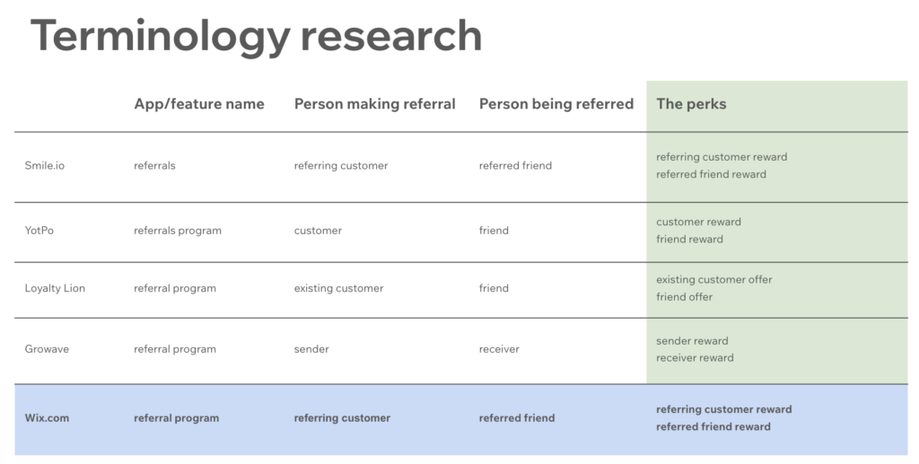
While the app name and the perks were straight-forward to figure out, here are some alternatives I considered for the person making a referral and the person being referred.
Person making the referral: referrer (complex, uncommon word; programming connotation), customer (unclear if it the user or the user-of-user, as people who are referred become customers too), member (Wix Stores and Wix Bookings don’t use this term), advocate (not used by competitors), ambassador (not used by competitors). The winning term was referring customer.
Person being referred: referee (all of the sports connotations), referral (the noun is the same as the verb which would be confusing), receiver (not widely used), friend (could work, but inconsistent with the format of “referring customer”). The winning term was referred customer.
The terms that I distilled through research became the foundation of the app.I presented them to the team and received overwhelmingly positive feedback.
The team were happy that the terms were anchored to extensive research and that we could start using the terms right away to work together effectively. Using different names for the same things (products, features, etc) had been frustrating for them when working on past projects.
Live site
When one installs the Wix Referral Program app, two pages get added to their website. First, it’s the main program page – the customers of our users can navigate to this page and grab a link to share with their friends.
Second, it’s the referred friend landing page. This is the page where people who click on a referral link land.
The main goal of the content on these two pages was to enable our users to run a referral program with minimal changes, if they so choose.
V1
Here are the two pages with the initial content that was presented to me by the product designer.
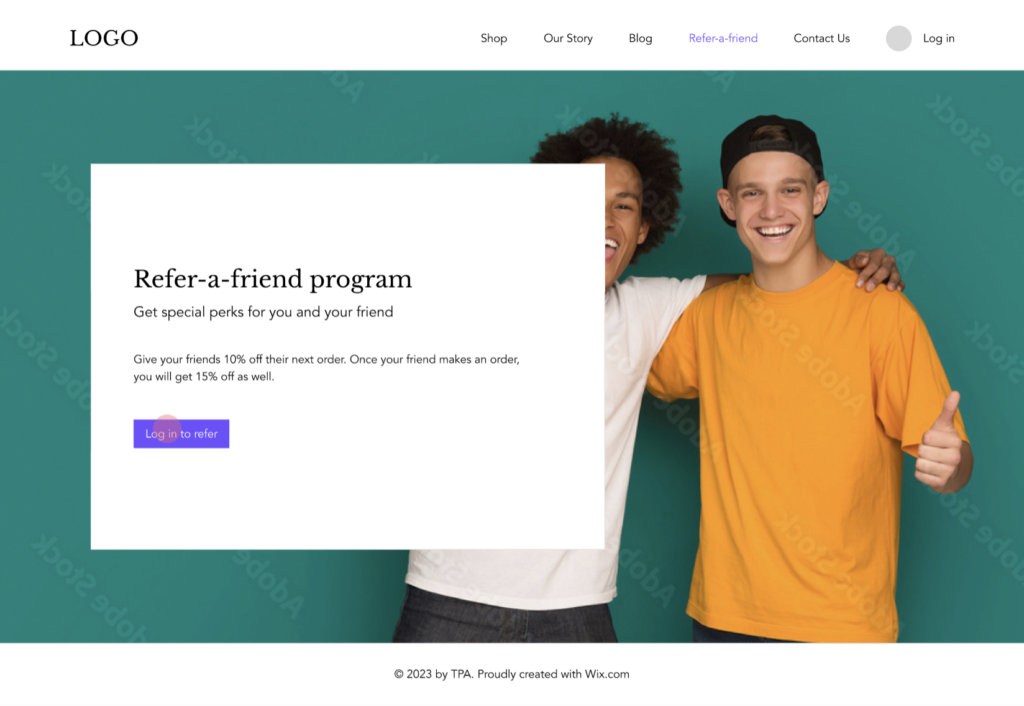

Two things stood out to me.
1. The content hierarchy is wrong.
The titles on both pages should entice people to click and that can only be done by telling them about the referral reward. The friend landing page should also have the reward in the title, because clicking on a referral link isn’t enough – we want them to use the reward they’ve been given to place an order and generate sales.
2. There is no place/method for listing the terms and conditions of a reward.
Both the referring customer and the referred friend can be rewarded (there’s also a way to reward just the one side, or no one at all). And most of the time, there will be conditions attached to the reward. It’s common market practise. We needed to find a place for them on the screen.
V2
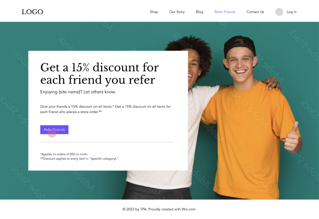
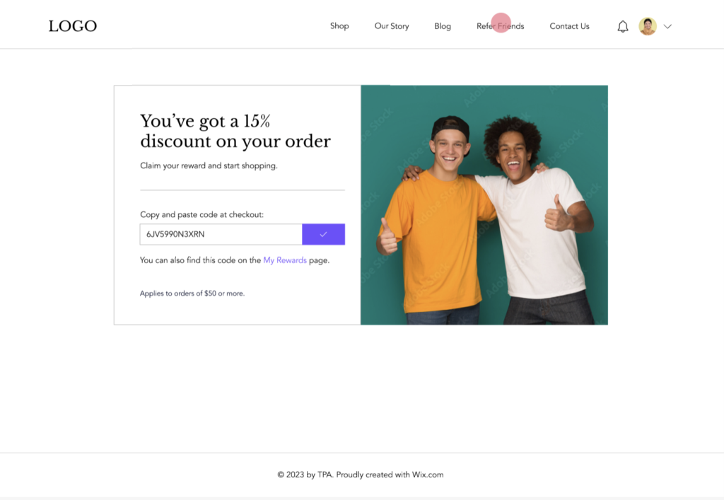
First, I included the reward for both the referring customer and the referred friend in the title. That meant that we needed to generate these titles based on the program settings that people have in the dashboard.
So, I worked on mapping out all of the possible title variations, taking into consideration the following:
- Both the customer and the friend can get a reward
- Either side can get a reward
- Neither side can get a reward
- The reward can be a coupon, of which there are three types – discount in %, discount in $, and free shipping
- The reward can also be loyalty points (e.g. Get 100 points for referring a friend)
Second, I also added asterisks to denote the terms and conditions of each of the rewards.
For example, a customer might only be able to spend their 15% discount on orders of $50 or more. And the friend might only apply their discount to items in a specific category of products on a site.
Because the customization of referral rewards is so granular at Wix, I spent a while mapping out all of the possible terms and conditions, across all four other apps that Wix Referral Program is integrated with. I worked with the writers of said four teams to establish terminology that’d work for their product.
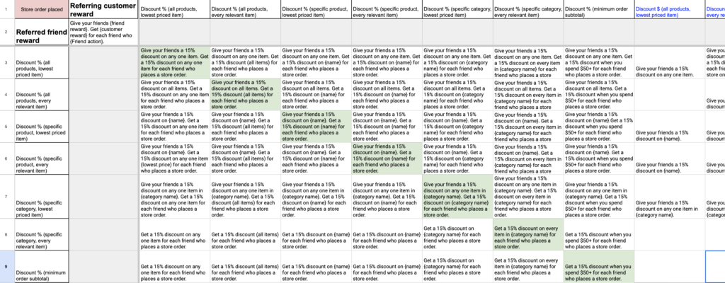
By doing this, it became apparent to me that having two long and rather complicated sentences in a paragraph didn’t make for great user experience. And whereas initially I tried adding some of the less complicated terms and conditions into the sentences themselves, it quickly got convoluted and I ditched the idea.
Enter v3.
V3
In this final version, I suggested to split up the paragraph into a numbered list. It makes it for easier reading and comprehension, even if skimmed.
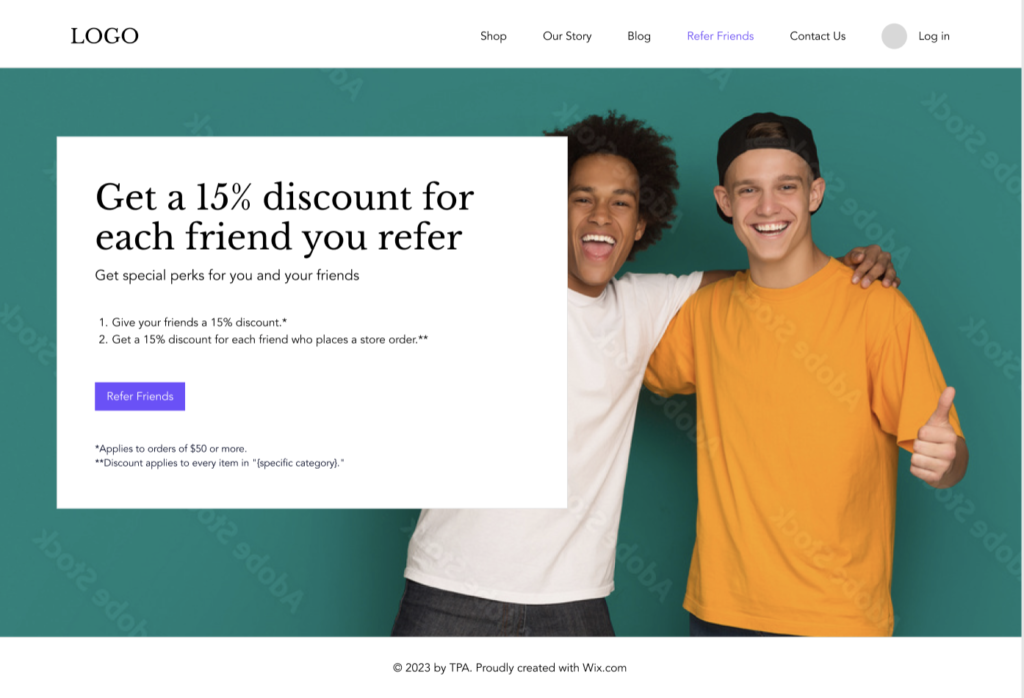
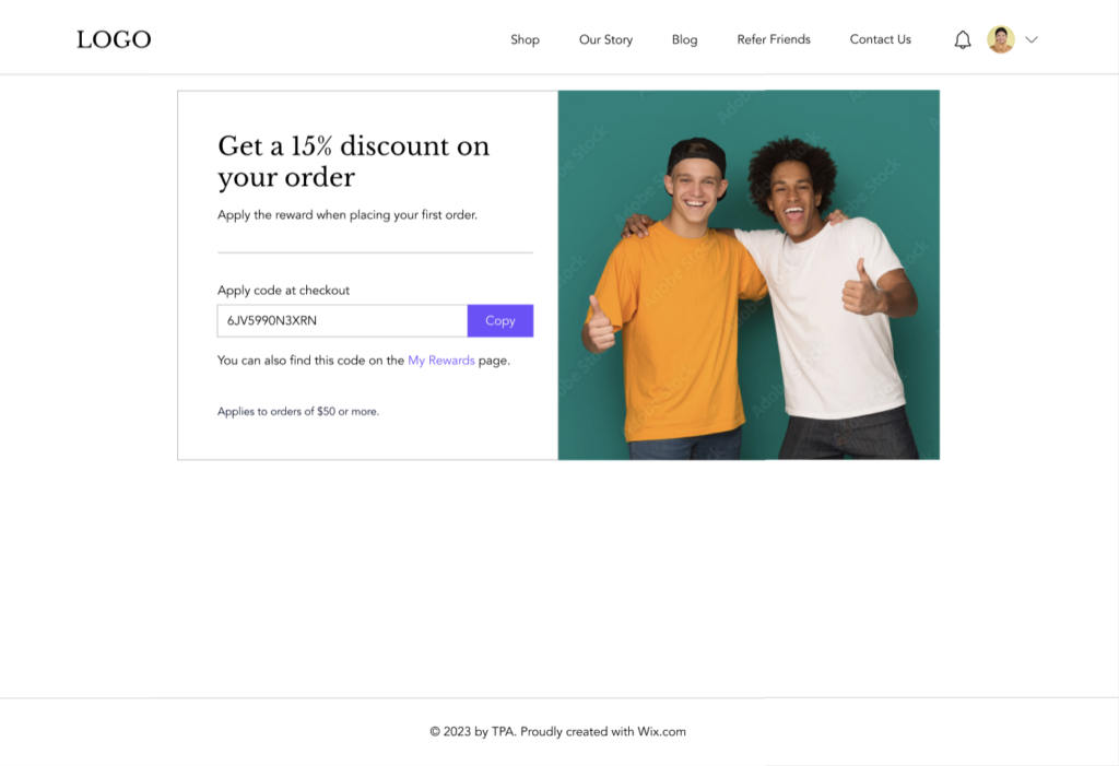
The resulting content of the two pages achieved the goal of being solid enough to run with. Our users would just need to change the background image to match their brand and they could get started with running a referral program right away.
Outcome
Over 350 keys of content were created during this project. There were also a lot of dynamic variables within those keys. It remains to be seen what impact they have on the KPIs.
The app is due to launch in Q2 of 2023. I will update this section when we start getting user data.