Members Area, Wix’s Owner app
Context
Members Area is a native Wix app that works on the web and on multiple mobile apps too. It lets site owners offer their customers to sign up and log in to their site, manage their accounts, hold subscriptions, and access member-only pages. Site owners can then manage all of their members in the dashboard.
Not all functionality that’s available on the web is available on the mobile apps. Our users were contacting support agents, asking why the function of blocking a site member doesn’t work on the Spaces by Wix app.
It was decided that we’d add this function to the mobile site owner app.
Problem
While a lot of the web content could be reused for the mobile app, the content for the flow when a site owner tries to block a member who has an active subscription proved to be problematic.
The content was too long for mobile. Plus, it was legacy content that didn’t fit with our current UX writing guidelines.
My role
I was the sole UX writer on this project, working together with a product designer and a front-end developer.
Process
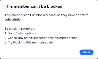
This was the modal on the web that I was provided and asked to shorten for it to fit in a mobile popup notification.
I realized that it’s not going to be enough to shorten it. There were multiple other things that were wrong here:
1. The title of this modal is a negative statement. It’s also wrong.
It’s good practise to stick to positive statements to avoid discouraging users. And from a functionality perspective, the member can be blocked. It’s just that they have an active subscription, which is preventing the site owner from blocking them at this moment.
2. The three step process is redundant.
The instructions are superfluous. We can get rid of the bullet points and change the weak CTA to take the user to Subscriptions directly, making for a much neater modal.
Here is the first draft of this modal that I proposed for our mobile app, taking into consideration the length, the numbered list, and the CTA.
It was striking how much of the content from the web modal could be deleted without leaving out any important information.
However, it was still a working draft. After discussing this modal’s content with the product designer, we decided that directing our users away from this screen and to the Subscriptions screen wasn’t good user experience.
Not only would that interrupt their flow, but it would also land them on a page with all of the subscriptions held by all of the members of the site. Technically, there was no way to land them to that exact person’s subscriptions.
The users would then need to to filter the content to find the member they’re trying to block. Not ideal.
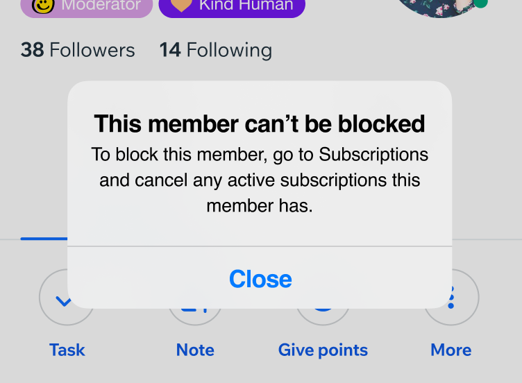
However, I realized that if our users close the “Member can’t be blocked” modal, they are faced with this view – the member profile. And all of their subscriptions are listed there and are clearly visible (underlined in green).
So, it’s much easier for them to close the modal and to view/cancel someone’s active subscriptions, than navigate to the separate Subscriptions screen and search for the member there.

With all that in mind, the final consideration was the title. There were two ways to go about it:
- This member can’t be blocked. This was the preferred choice of the product designer, as it was consistent with the language of the action item that the user clicks on to block the member (see screenshot of the flow below).
- This member has an active subscription. This was my preferred choice and the title that we ended up going with. While it is important that the title closely follows the wording of the previous action, I felt it was clearer and more encouraging to our users to give the title a positive slant. We also save real estate by telling users what the issue is; it’s the most important information on the screen and I wouldn’t want to leave it in the subtitle where it gets skimmed at best.
Result
This is the flow that we ended up with. There hasn’t been a single support ticket registered in relation to this feature since November, 2022.
Based on the work we did on mobile, we also went back and changed the legacy content on web, improving the user experience there too.
